This case study explores the end to end conceptual design process, involving both small team collaboration and individual work, as part of an intensive UI/UX Design course through the University of Wisconsin.
Topic Research*
Competitive Analysis*
User Interviews*
Affinity Map*
Persona*
User Flow*
Wireframes
Mid-Fi Mockups & Prototype
Style Guide*
Usability Testing
High-Fi Mockups & Prototype
User Testing
* collaborative
I contributed substantially to the items listed as collaborative. I did not include the elements completed entirely by others on the team.
We researched four digital products currently on the market that offer services related to food tracking, planning, and waste prevention
I conducted 4 conversational phone interviews. Our group completed a total of 14 user interviews. Our goal was to identify pain points and gain a deeper understanding of household food waste and to help inform group decisions on app functionality and features.
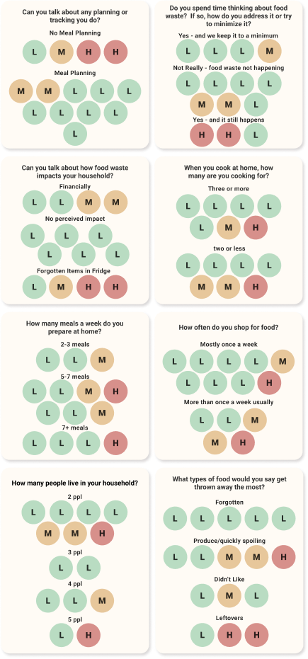
How often do you shop for food?
How many people live in your household and what are their ages?
How many meals a week do you prepare at home?
Can you talk about any planning or tracking you do related to the purchase or preparations of meals throughout your week?
Do you spend time thinking about food waste? If so, how do you address it or try to minimize it?
When you cook at home, who are you cooking for and what are you preparing?
Can you talk about how food waste impacts your household?
What types of food would you say get thrown away the most?
We started by identifying our users as low, medium, or high waste.
Almost half of users interviewed believe they create little to no food waste – these users meal plan most regularly.
The most common reason for waste is forgotten items.
The second most common reason is food spoiling before it’s planned usage.
These reasons line up directly with consumers that shop once a week or less
We then grouped like answers to each question to identify trends.
Using our data compiled from our interviews, we created a persona for someone that has current food waste levels that could potentially be reduced via a digital solution. I worked primarily on the content & layout, another team member handled the imagery.
Americans are concerned with and want to reduce food waste
Almost half put themselves in a no-waste category, 2/3 if you include low waste. Could be a lack of awareness & understanding of the problem
Food waste is due in-part to the over purchasing of food
This was mentioned by multiple users as a contributing factor.
Forgotten items leads to waste
This was identified as the largest contributor to waste.
We created a top-level list of app features. The project brief required the design and prototyping of a singular user flow.
At this point it was time to decide what kind of digital product we were going to design. It was a fairly straightforward decision
A mobile first approach starting with a native app would be more versatile and physically accessible than a website.
Add an item to the Inventory using a barcode scanner
a few pens, markers, and a sketch book get the ideas flowing
Next up – get those ideas from paper into Figma
While building these designs I focused on
Layout – Ease of Use – Component Building – Information Architecture
Once the wireframes were built it was time to prototype them so I could test the app with potential users. The prototype is for the user flow of adding an item to the inventory using the barcode scanner.
Test the user flow for functionality and intuitive design at the wireframe stage
Add an item to the inventory using the barcode scanner
The user is able to navigate the prototype with ease and successfully add an item to their inventory
Gather insight from users to understand pain points, likes, dislikes, & overall response to the application
5 moderated user tests were conducted. All 5 participants completed the task easily. 1 of the 5 had minor troubles due to forgetting the initial instructions, but completed the task easily once reminded of the instructions.
The shortcut area at the top of the screen was the first thing every tester noticed and the location and function were well received.
The Track your Trash feature was mentioned by every tester. It generated lots of curiosity and interest.
The simplicity and ease of use was specifically mentioned by multiple testers. Overall, the design proved successful.
The space at the top of the screen is highly important and should be utilized accordingly.
The Track your Trash feature is a definite keep in the final product.
Tasks that are most common to the overall usage of the app should require as few clicks/steps as possible
There were a few excellent suggestions for design opportunities. One was to add tracking of which store items are purchased from, the preferred store for items on the shopping list, and the price paid for an item.
Another great suggestion was to modify slightly the location of the shortcut area. If they were at the very top it would create better proximity between the page heading buttons and content.
An app function guide that explains each section, screen, button, tool, etc. on first usage of the app would be beneficial, along with a help or learning section that can be accessed at anytime.
The arrows show the areas where changes have been made
Moved shortcuts to the top to improve the proximity of the heading buttons and main content
Increased spacing of cards
Decreased size of shortcut icons to allow more space for main content
Added ability to track cost and purchase location
Adjusted spacing & sizing to improve balance and give little more breathing room
The style guide for this project is a combination of group and individual work.
The primary color palate, typography, & logo were created collaboratively.
The majority of the design choices were individual.
I really appreciate you taking the time to scroll all the way down here to check out my case study. I’d be grateful to hear your feedback.